GlucoTrack
Personal Project
Role: Lead Designer
Project Main Goal

GlucoTrack is a mobile app designed to help individuals with diabetes easily monitor, track, and manage their blood sugar levels through an intuitive and user-friendly interface.
Discovery - Personas definition
The personas were created to represent key user needs and behaviours, helping guide design decisions focused on clarity, speed, and meaningful glucose insights.

Day-to-Day Diabetes Manager
Role: Adult managing Type 1 or Type 2 diabetes
Goals: Keep glucose in range with minimal steps
Pain Points: Overwhelming UI, slow logging
Needs: Clear chart + quick add button + notifications

Data-Driven Health Planner
Role: Person focused on long-term health insights and pattern tracking
Goals: Understand longer–term patterns
Pain Points: Trends hard to interpret
Needs: Weekly & monthly analytics, context insights

Busy Lifestyle Tracker
Role: Person with a busy schedule who needs fast, on-the-go checks
Goals: Fast reads on the go
Pain Points: Clunky entry, intrusive alerts
Needs: Glanceable status + subtle reminders
Discover - Competetive Analysis
Dexcom is a leading continuous glucose monitoring app that provides real-time glucose data, trend analysis, and alerts.
It was chosen as a competitor due to its strong presence in the market and comprehensive feature set, serving as a useful reference for understanding best practices and potential usability gaps in glucose tracking experiences.
Trend arrows and graphs aren’t always intuitive.

Data density can feel overwhelming.
‘…I just got on Dexcom G6 and while I know it will be a huge asset to me, right now it’s just utterly overwhelming trying to start from square one and gain control’ - User's voice - Reddit (source)
Accessibility (font size, color contrast) can be a barrier.
‘My biggest problem with Dexcom? No dark mode. My eyes aren't what they used to be, and dark text on white background is hard to read.’ - User's voice - Reddit – r/dexcom (source)
Alert Fatigue
'...What I find so absolutely frustrating is the complete lack of control for so many alerts that can't be turned off…’ - User's voice - Forum (source)
‘...I just cannot stand the constant alerts anymore…’ - User voice - Forum (source)
Define
-
Goal: Create a next-generation Continuous Glucose Monitor (CGM) experience.
-
Audience: Initially designed for people with Type 1 diabetes, the product aims to eventually engage a wider audience of wellness users interested in metabolic health.
-
Current Gap: Existing CGM apps provide medical accuracy but lack visual clarity and actionable insights.
-
Opportunity: Design a simplified, visually clear, and insight-driven CGM experience that helps users.

Deliver
The home screen highlights the user’s current glucose level with clear colour coding (green for safe, yellow for borderline, and red for critical) so severe readings stand out instantly.
A dynamic trend graph mirrors these colours with smooth transitions, making patterns easy to understand at a glance.

Users can explore trends in more detail with pinch-to-zoom, revealing exact timestamps and values.
As they scroll, the glucose reading shrinks to keep focus on insights, while a fixed time picker supports easy navigation.
A customisable summary section lets users prioritise key metrics, enhanced by AI-driven insights like “Glucose has been stable for 2 hours.”
.png)
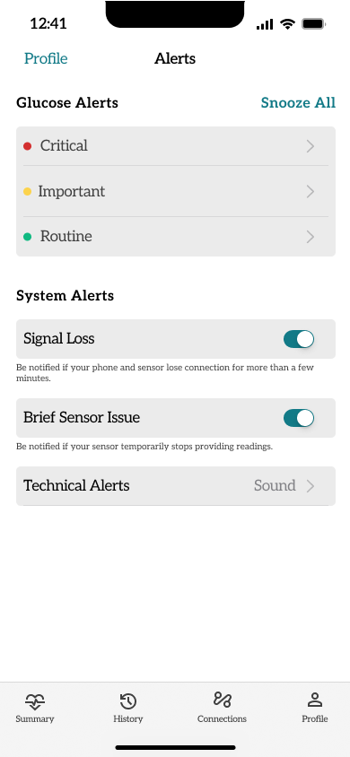
Global Alerts: These alerts surfaces essential system messages like signal loss or brief sensor issues, keeping users informed.
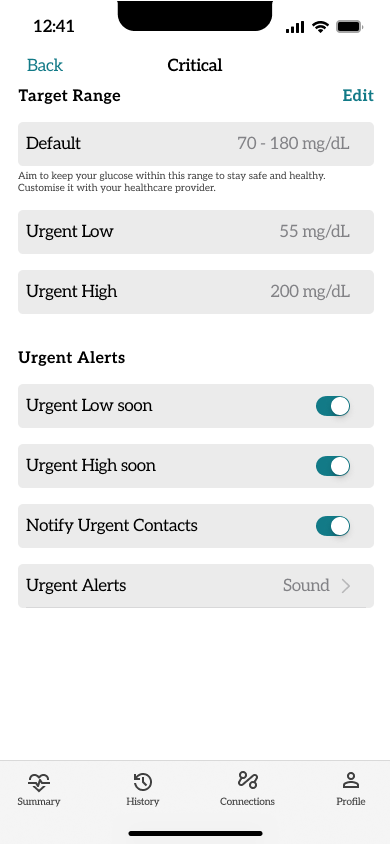
Specific Alerts: Glucose Alerts, from mild changes to critical highs or lows, helping users act quickly and confidently.
Notifications: On the Lock Screen, key alerts appear at a glance. Concise, discreet, and always accessible when it matters most.